Building an SVG Icon System for Web Projects
Icons come up in every project these days. Here’s a generic solution to the foundation that I use to manage icons in all my projects.
Icons are a part of our lives on the web. They make their way into almost every project. Some projects may even require the use of dozens or hundreds of icons. Having a system that works for simple projects and can scale is a necessity is for maintaining productivity.
Consistency is Key
The key to it all is to be consistent. The exact tooling doesn't matter. What matters is that you develop common dimensions, color patterns, names, styles, etc. These things are unique to your projects and your ways of working, but they are crucial to the system's success, regardless of the tooling you choose to use.
Finding the Right Icon Source
You may have a designer that handles sourcing or creating all your icons. If not, you want to find a reliable system. I like The Noun Project because there is a wide range of icons available, which I can use without attribution because I pay for a license.
The challenge with a shared source like The Noun Project is that it's up to you to curate similar-styled icons, or some may not look like they belong. Going with a specific icon library (Untitled is one of my favorites lately) has the benefit of being created by a single source with the purpose of creating a cohesive set.
Using Figma to Drive Consistency
Using Figma as the basis for this system makes working with icons super easy. Figma is all about developing design systems and has several thoughtful features to support this.
The rest of the post looks at how this process works in Figma.
The First Icon
Let's look at how to get the system started. I'll be bringing in an icon from The Noun Project, but you can source from anywhere.
Rework Layers After Import
Typically, when importing from another source, there are a number of adjustments I make to the icon. These typically include:
- Extracting layers from a group or frame.
- Convert strokes to vector objects
- Creating a union shape when there are multiple shape of a similar style (sometimes you may have to use a group instead).
- Rename the layer (shape, union, or group) to represent the name of the icon.
- Delete the previous container and any other artifacts from the import.
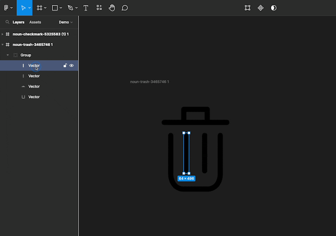
Resizing the Icon
Next, you want to choose a size for your icons. What you're choosing is the biggest dimension that any icon will use. The frame for every icon will be square. I'll use 100 as an example, but you can pick whatever you want.
To resize an icon:
- Select the shape
- Constrain the dimensions
- Replace the larger dimension with your bounding value (
100in my example)

Make sure that your icon position (x and y) is set to an integer and not a decimal. There are odd artifacts when we copy when using a decimal.
In the end, you should have a set of mostly clean, round numbers for your dimensions and position. Note that the smaller dimension may be a decimal. That's okay — what matters is that it is smaller than your preferred dimension.
Building a Square Frame
Now we want to make a square frame that we can reuse for all icons. To do this, first select the shape, right (or secondary) click, and choose frame selection. (There is also a keyboard shortcut for this, which will be noted in the context menu.)
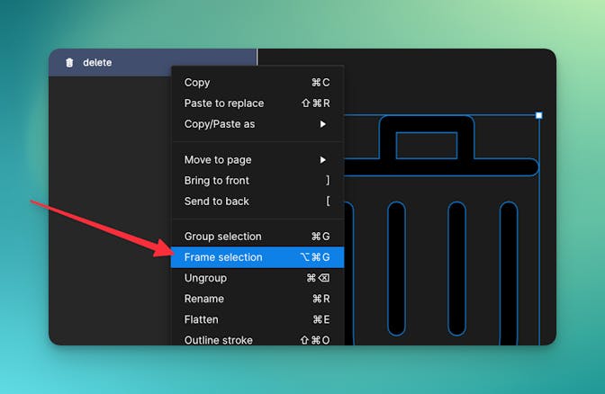
With the frame created, select the inner shape, and constrain its position to center and center.

Select the frame again, and change its dimensions to be square.

Your shape will be in the middle of the frame, which should now be square.
Once that is done, remove the position constraints from the inner shape. This is necessary for allowing your other designs in Figma to resize the icon.
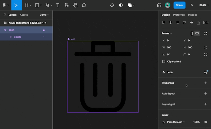
Copying SVG Code
And now you have an icon within a square frame, and you're ready to use it in your project. Right click on the frame, and choose Copy/Paste as and select Copy as SVG.

Then you can paste right into the appropriate file in your project. Here's an example of the output.
<svg
  width="100"
  height="100"
  viewBox="0 0 100 100"
  fill="none"
  xmlns="http://www.w3.org/2000/svg"
>
  <path
    fill-rule="evenodd"
    clip-rule="evenodd"
    d="M13.0769 21.5385C11.3787 21.5385 10 20.1597 10 18.4615C10 16.7633 11.3787 15.3846 13.0769 15.3846H33.0769V3.07692C33.0769 1.37872 34.4556 0 36.1538 0H63.8462C65.5444 0 66.9231 1.37872 66.9231 3.07692V15.3846H86.9231C88.6213 15.3846 90 16.7633 90 18.4615C90 20.1597 88.6213 21.5385 86.9231 21.5385H13.0769ZM60.7692 6.15385H39.2308V15.3846H60.7692V6.15385ZM63.8462 100H36.1538C25.1106 100 17.6923 91.3449 17.6923 78.4615V33.8462C17.6923 32.1479 19.071 30.7692 20.7692 30.7692C22.4674 30.7692 23.8462 32.1479 23.8462 33.8462V78.4615C23.8462 85.8985 27.0799 93.8461 36.1538 93.8461H63.8462C72.9201 93.8461 76.1538 85.8985 76.1538 78.4615V33.8462C76.1538 32.1479 77.5326 30.7692 79.2308 30.7692C80.929 30.7692 82.3077 32.1479 82.3077 33.8462V78.4615C82.3077 91.3446 74.8894 100 63.8462 100ZM57.6923 33.8462V75.3846C57.6923 77.0828 59.071 78.4615 60.7692 78.4615C62.4674 78.4615 63.8462 77.0828 63.8462 75.3846V33.8462C63.8462 32.1479 62.4674 30.7692 60.7692 30.7692C59.071 30.7692 57.6923 32.1479 57.6923 33.8462ZM36.1538 75.3846V33.8462C36.1538 32.1479 37.5326 30.7692 39.2308 30.7692C40.929 30.7692 42.3077 32.1479 42.3077 33.8462V75.3846C42.3077 77.0828 40.929 78.4615 39.2308 78.4615C37.5326 78.4615 36.1538 77.0828 36.1538 75.3846Z"
    fill="black"
  />
</svg>
Cleaning Up the Export
This code isn't always perfect. Here are a few notes on cleaning up the copied code:
<g>elements are groups and can typically be removed.<def>can also typically be removed.- Take care to remove closing tags for any elements you remove.
- I've removed
fill-ruleandclip-rulewithout effect in some cases, but it caused problems in other cases.
Change fill in your <path> elements to currentColor. This will make the SVG path inherit the nearest ancestor with a color value set. It makes changing the color of icons super simple.
Using the Icon
You can also use the icon directly in your Figma project with these steps:
- Make it a component (right click on the frame and choose Create component)
- Rename the frame to "Icon" (or whatever you want the component to be called)
Then you can use the assets tab to pull it onto any page in Figma.

Scaling for Multiple Icons
And now we're ready for adding the next icon to the project.
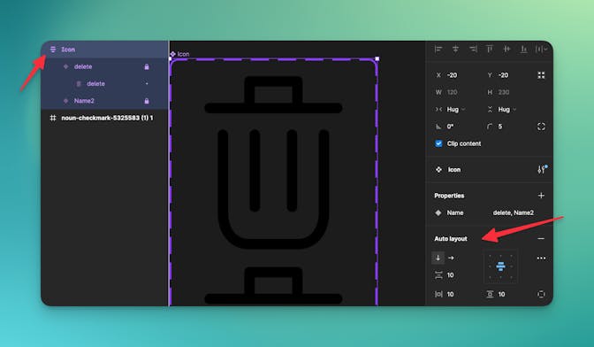
Creating a Component Variant
After creating a component in Figma for your icon, you can create a variant for a second icon.
- Select the component frame
- Add a variant property
- Rename the property to "Name" (or something similar)
Then I typically select the first variant and set the variant property to match the name of the icon shape I set earlier.

Add a new variant by clicking the plus icon below the first shape.
Using Auto Layout to Organize Variants
This may lead to a goofy layout. If that happens, use an auto layout on the component frame to fix the problem.
Insert Second Icon
Then it's time to add the next icon, which is essentially following the steps above again:
- Copy or insert another icon directly in the new variant
- Clean up the imported icon
- Resize to set the max dimension
- Center vertically and horizontally
(Skip to about 6:00 in the video at the top of this post to go through the process.)
And that's it! You now have the beginning of a scalable icon system that you can use in any front-end project.
Keep Reading

3 things I learned using Claude as my creative director
I'm using Claude as the creative director for my personal rebrand, where I play the client and Claude is the agency. This is what I've learned so far.

Introducing Continuous Abstraction
Abstract core components of related challenges to make solving future challenges easier and faster.

Simplify Context Switching with Browser Tab Groups
Browser tab groups can help contextualize tabs to make it easier to jump back into a project after you’ve been pulled away.