How to Add SVG Icons to a React Project
Vector icons have become an essential part of nearly every web project. Stay consistent and organized when adding icons to a React project.
Nearly every project I build for the web includes some sort of icon set. Over the years, I've built an icon system that is super easy to use. You can take this and adopt it, replacing the tools I use with your preferences.
Determine the Right Icon
Once you establish a need for an icon, you likely have a clear picture in your head of what it should be. If you do and want to create it from scratch, great! That's your first step — create the icon with your favorite design software.
I'm less confident in my ability to design icons and usually prefer to move faster, so I use prebuilt icon sets to help me. My preference for the last few years has been to use The Noun Project.

I pay for this service so that I can use these icons with proper licensing (without attribution).
Alternative Icon Libraries
There are many icon libraries that you can use. Likely many free ones, too. A bit of googling may help you find what you need if The Noun Project doesn't seem like the right fit.
I've also seen some great results on Icons8, although I don't use it — I prefer to pay for only one icon service at a time.
Resize and Simplify the Icon in a Design Tool
After I download the vector version of the icon I selected, I then import it into my preferred design tool, Figma.
I then simplify the component by doing the following:
- Create an artboard (Figma calls these frames) of a consistent size for the icon. I tend to use
200x200, but these are vectors, so use whatever you prefer. - Scale the icon so that the largest dimension is the same as the largest dimension of your frame (
200pxin the example), then center the icon in the frame/artboard. This may lead to a little extra space on the sides or ends if the shape isn't square, and that's totally fine. - Remove any extra layers from the download (more on this below).
- Outline any strokes in the icon. Every layer should be able to be filled with color, as this enables proper scaling in your application.
- Some designers use a solid color to indicate void space. I play around until I can make this negative space, as we only want the icon to be a single color. If it doesn't work, I usually go find another icon.
- (optional, based on preference) Merge the shapes into a single object.
- (optional) Make the color of the icon solid and consistent. I use
#000000(black) for icons and transparent for the artboard/frame.
Removing the Extra Layers
Vector downloads from The Noun Project often come with several additional layers, including a group around the icons. I like to remove these so that I'm left with a single, outlined object within the frame.
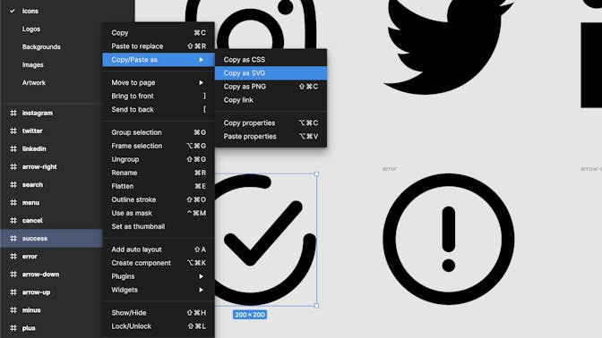
Export Artwork
Then I export the frame (NOT the object) as an SVG. It's important to select the artboard/frame using the consistent size established above. This will enable you to keep cleaner code later on. We want every icon to be the exact same size (mine are square, 200x200), regardless of the dimensions of the actual shape.
Note that some tools (like Figma) offer a Copy as SVG feature that enables you to avoid exporting a file. This is my preferred method when available, as it saves some time.
Import Code
Next, in a series of steps, we'll take that copied/exported code and bring it into your project. I like to put all my icons in a single Icon.jsx component until I reach a number that makes the file feel unwieldy. But, for most projects, I prefer this because it's a bit less code.
Paste and Reactify the Code
When you paste the initial code, it probably looks something like this.
<svg
  width="200"
  height="200"
  viewBox="0 0 200 200"
  fill="none"
  xmlns="http://www.w3.org/2000/svg"
>
  <g clip-path="url(#clip0_112_9)">
    <path
      fill-rule="evenodd"
      clip-rule="evenodd"
      d="M179.481 100C179.481 94.4772 183.958 90 189.481 90C195.004 89.9999 199.481 94.4771 199.481 100C199.481 155.228 154.709 200 99.4806 200C73.2171 199.939 48.0475 189.475 29.4806 170.9C10.7376 152.258 0.138707 126.953 0.00137833 100.518C-0.285522 45.2904 44.2529 0.286908 99.4806 0C107.461 0.03307 115.412 0.97243 123.181 2.8C123.59 2.87249 123.994 2.97039 124.391 3.09314C129.667 4.72514 132.621 10.3253 130.989 15.6015C129.357 20.8778 123.757 23.832 118.481 22.2C112.246 20.7777 105.875 20.04 99.4807 20C78.1779 19.9315 57.7435 28.4368 42.7806 43.6C27.8895 58.58 19.5269 78.8412 19.5172 99.9634C19.497 144.146 55.2978 179.98 99.4807 180C143.663 180 179.481 144.183 179.481 100ZM62.3941 92.9C66.3153 88.9788 72.6729 88.9788 76.5941 92.9L99.4941 115.4L161.694 43.4C165.286 39.6604 171.141 39.2867 175.179 42.5393C179.48 46.0036 180.158 52.2988 176.694 56.6L106.694 136.6C104.868 138.681 102.261 139.912 99.4941 140C96.8361 140.015 94.2813 138.972 92.3941 137.1L62.3941 107.1C58.4728 103.179 58.4728 96.8213 62.3941 92.9Z"
      fill="black"
    />
  </g>
  <defs>
    <clipPath id="clip0_112_9">
      <rect width="200" height="200" fill="white" />
    </clipPath>
  </defs>
</svg>
This is not what we want, because:
- We can remove a lot of these elements that aren't doing anything for us.
- Attributes need to be in camelCase.
- We want more control over the color.
In most cases, I can take the above code and simplify it to this:
src/components/Icon.jsx
export const SuccessIcon = () => {
  return (
    <svg viewBox="0 0 200 200" fill="none" xmlns="http://www.w3.org/2000/svg">
      <path
        d="M179.481 100C179.481 94.4772 183.958 90 189.481 90C195.004 89.9999 199.481 94.4771 199.481 100C199.481 155.228 154.709 200 99.4806 200C73.2171 199.939 48.0475 189.475 29.4806 170.9C10.7376 152.258 0.138707 126.953 0.00137833 100.518C-0.285522 45.2904 44.2529 0.286908 99.4806 0C107.461 0.03307 115.412 0.97243 123.181 2.8C123.59 2.87249 123.994 2.97039 124.391 3.09314C129.667 4.72514 132.621 10.3253 130.989 15.6015C129.357 20.8778 123.757 23.832 118.481 22.2C112.246 20.7777 105.875 20.04 99.4807 20C78.1779 19.9315 57.7435 28.4368 42.7806 43.6C27.8895 58.58 19.5269 78.8412 19.5172 99.9634C19.497 144.146 55.2978 179.98 99.4807 180C143.663 180 179.481 144.183 179.481 100ZM62.3941 92.9C66.3153 88.9788 72.6729 88.9788 76.5941 92.9L99.4941 115.4L161.694 43.4C165.286 39.6604 171.141 39.2867 175.179 42.5393C179.48 46.0036 180.158 52.2988 176.694 56.6L106.694 136.6C104.868 138.681 102.261 139.912 99.4941 140C96.8361 140.015 94.2813 138.972 92.3941 137.1L62.3941 107.1C58.4728 103.179 58.4728 96.8213 62.3941 92.9Z"
        fill="currentColor"
      />
    </svg>
  );
};
That's a lot of changes. Here's a summary:
- We'll set width globally and height will be inferred, so we remove those from the
<svg>element. - The group and clip paths aren't doing anything for these simple shapes and can be removed.
- In most cases, I've found that removing the
fill-ruleandclip-rulehas no effect. If you want or need to keep it, change it to camel case (fillRuleandclipRule). - The
fillattribute gets changed tocurrentColor, which will make the icon automatically inherit the color of its parent.
Add Global Styles
To avoid setting width on every <svg> element, be sure to set a global style for svg elements to have a width of 100%.
svg {
  width: 100%;
}
This will make the parent element the source of truth for sizing the icon, which I've found to be a much more pleasant way of working.
If you don't want all SVGs to behave in this way, you can use a class selector instead, and then add the class to the SVG element.
Shared Icon Wrapper
When adding a large number of icons, you may not want to repeat the cleanup to the <svg> element every time. Instead, you can have a shared wrapper, like this:
src/components/Icon.jsx
const IconWrapper = ({ children }) => {
  return (
    <svg
      viewBox="0 0 200 200"
      fill="none"
      xmlns="http://www.w3.org/2000/svg"
      className="icon"
    >
      {children}
    </svg>
  );
};

export const SuccessIcon = () => {
  return (
    <IconWrapper>
      <path
        d="M179.481 100C179.481 94.4772 183.958 90 189.481 90C195.004 89.9999 199.481 94.4771 199.481 100C199.481 155.228 154.709 200 99.4806 200C73.2171 199.939 48.0475 189.475 29.4806 170.9C10.7376 152.258 0.138707 126.953 0.00137833 100.518C-0.285522 45.2904 44.2529 0.286908 99.4806 0C107.461 0.03307 115.412 0.97243 123.181 2.8C123.59 2.87249 123.994 2.97039 124.391 3.09314C129.667 4.72514 132.621 10.3253 130.989 15.6015C129.357 20.8778 123.757 23.832 118.481 22.2C112.246 20.7777 105.875 20.04 99.4807 20C78.1779 19.9315 57.7435 28.4368 42.7806 43.6C27.8895 58.58 19.5269 78.8412 19.5172 99.9634C19.497 144.146 55.2978 179.98 99.4807 180C143.663 180 179.481 144.183 179.481 100ZM62.3941 92.9C66.3153 88.9788 72.6729 88.9788 76.5941 92.9L99.4941 115.4L161.694 43.4C165.286 39.6604 171.141 39.2867 175.179 42.5393C179.48 46.0036 180.158 52.2988 176.694 56.6L106.694 136.6C104.868 138.681 102.261 139.912 99.4941 140C96.8361 140.015 94.2813 138.972 92.3941 137.1L62.3941 107.1C58.4728 103.179 58.4728 96.8213 62.3941 92.9Z"
        fill="currentColor"
      />
    </IconWrapper>
  );
};
Consolidated Export Strategy
You'll notice that I've exported the individual icon component, which makes it easy to include it directly elsewhere in the application. I also tend to add an exported object, as I may change how I want to work with these icons syntactically throughout the application.
src/components/Icon.jsx
export const Icon = {
  arrowDown: ArrowDownIcon,
  arrowRight: ArrowRightIcon,
  arrowUp: ArrowUpIcon,
  cancel: CancelIcon,
  error: ErrorIcon,
  help: HelpIcon,
  instagram: InstagramIcon,
  linkedin: LinkedInIcon,
  menu: MenuIcon,
  minus: MinusIcon,
  plus: PlusIcon,
  search: SearchIcon,
  success: SuccessIcon,
  twitter: TwitterIcon,
};
That's it! The icon is now ready to be used in your components. See below for a live demo. There are some extra tips and tricks following the demo.
React Icons Playground/Demo
Here it is in action!
Bonus: Tips for Building Solid Icon Sets
Before you go, here are a few tips while you're building out an icon set for your project.
- Be Consistent with Design Tooling: Keep the sizing and coloring strategies consistent, as mentioned above. If you ensure you're using an artboard that is the same size for every icon, you're much less likely to introduce issues into your application.
- Match the Style of Your Site: The icon set I've shown above is not a good example. Notice that different icons are different thicknesses. Some are thin, others thick. Some are rounded, others sharp. This isn't good. Establish a general aesthetic and then try to stay consistent. Choose filled vs outline, thin vs thick, sharp vs rounded — whatever works best for your project.
- Build Your Own Icon Library: While you want to match the style of the project, you may still notice that you tend to use similar styles from project to project. Rather than gathering icons in a project design file, it may be helpful to have a shared icon library so that you can pull from icons you've built or used in the past.
That's it for now. Happy coding!
Keep Reading

3 things I learned using Claude as my creative director
I'm using Claude as the creative director for my personal rebrand, where I play the client and Claude is the agency. This is what I've learned so far.

Animated Sliding Tabs with React and Tailwind
Add some flair to a simple tab solution by adding an animated bottom border.

