
Use a Class Map to Set Dynamic Styles
Components often need to use styling based on property combinations. There are a number of ways to solve this, but only one I’ve found to be the cleanest.
While we often adjust logic based on properties sent to components, I've found that styling tends to be more dynamic. Let's look at how we can account for this in a way that scales with the number of options you have.
The specific code I'm showing and its corresponding demo use Next.js and React, but you could apply this thinking to any framework.
Theming a Button
A button is the classic use case here. Let's say I have a simple list of three buttons on a page.
pages/index.tsx
import { Button } from "../components/Button";

export default function Home() {
  return (
    <main>
      <div className="flex space-y-4 flex-col p-4">
        <Button>Green Button</Button>
        <Button>Purple Button</Button>
        <Button>Outline Button</Button>
      </div>
    </main>
  );
}
And a simple button component that adds a bit of styling (using Tailwind-like classes).
components/Button.tsx
type ButtonProps = {
children: string;
};
export const Button: React.FC<ButtonProps> = (props) => {
return (
<span className="inline-block bg-emerald-500 text-white py-3 px-8 rounded-md text-center border border-emerald-500 hover:bg-emerald-600 hover:border-emerald-600 transition-colors duration-300 hover:cursor-pointer">
{props.children}
</span>
);
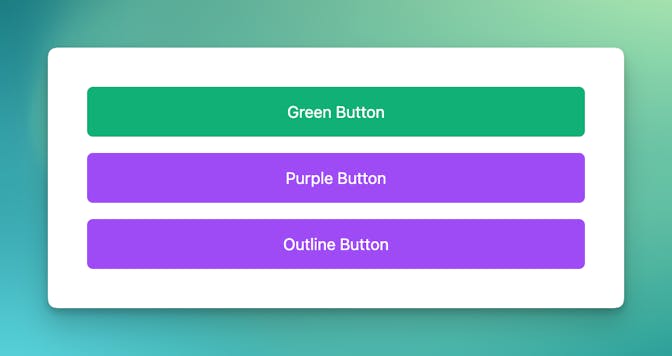
};Without anything to control the theming, my three buttons look like this:

What I want to do is find a way to let a theme property control a series of styles for the buttons.
I'm using TypeScript in the example above because it helps out significantly when we get to the final solution. If you don't know TypeScript, you can ignore this and use the JavaScript code.
Adding the First Theme
I've seen developers do a lot of different things to be able to accomplish the theming we're looking for here.
Let's first explore some methods that ultimately don't scale well.
Using a className Property
You could expose the className property and let every instance of every button write its own class names.
Other frameworks may use a different to pass class selectors to components, but the idea is the same.
That's generally a bad idea. You're going to end up with a lot of duplicated code, a lot of small mistakes, and way too much to test.
import { Button } from "../components/Button";

export default function Home() {
  return (
    <main>
      <div className="flex space-y-4 flex-col p-4">
        <Button className="bg-green-500 ...">Green Button</Button>
        <Button className="bg-purple-500 ...">Purple Button</Button>
        <Button className="border border-slate-...">Outline Button</Button>
      </div>
    </main>
  );
}
Using a theme Property
Another approach is to use a property to indicate a series of classes that can be used on the button. I tend to like this approach. And in our example, let's call the property theme.
We'll use TypeScript to define the property options — green, purple, or outline. (These are arguably not great name choices, and are used primarily to make the point here.) And we'll make sure that we have a default value set for theme in our component (green in the example below).
components/Button.tsx
type ButtonProps = {
  children: string,
  theme: "green" | "purple" | "outline",
};

export const Button: React.FC<ButtonProps> = ({
  children,
  theme = "green",
}) => {
  // Do something with theme ...
};
Handling Theming with a Ternary
If we start with just two themes (green and purple), a ternary can seem like a great choice.
We simply extract the theme-based classes into a variable (themeClasses) and set that variable based on the value of theme inside the component.
components/Button.tsx
type ButtonProps = {
  children: string,
  theme: "green" | "purple" | "outline",
};

export const Button: React.FC<ButtonProps> = ({
  children,
  theme = "green",
}) => {
  const themeClasses =
    theme === "green"
      ? "bg-emerald-500 text-white border-emerald-500 hover:bg-emerald-600 hover:border-emerald-600"
      : "bg-purple-500 text-white border-purple-500 hover:bg-purple-600 hover:border-purple-600";
  return (
    <span
      className={`inline-block py-3 px-8 rounded-md text-center border transition-colors duration-300 hover:cursor-pointer ${themeClasses}`}
    >
      {children}
    </span>
  );
};
Despite a large number of classes (thanks, Tailwind), this actually works quite well. It's relatively easy to see what's going with the styling logic.
And if we use our theme property on the page components ...
pages/index.tsx
<Button>Green Button</Button>
<Button theme="purple">Purple Button</Button>
<Button theme="outline">Outline Button</Button>
We can then see that the first button is green and the other two are purple.
The outline button appears as purple because we're falling back to the purple classes when theme is not green. Thus, if theme isn't green, the button is purple.
Adding a Third Theme
The challenge with ternaries becomes immediately apparent when you add the third style. The code would look something like this.
components/Button.tsx
export const Button: React.FC<ButtonProps> = ({
  children,
  theme = "green",
}) => {
  const themeClasses =
    theme === "green"
      ? "bg-emerald-500 text-white border-emerald-500 hover:bg-emerald-600 hover:border-emerald-600"
      : theme === "purple"
      ? "bg-purple-500 text-white border-purple-500 hover:bg-purple-600 hover:border-purple-600"
      : "bg-white text-slate-800 border-slate-800 hover:bg-slate-900 hover:border-slate-900 hover:text-white";
  return (
    <span
      className={`inline-block py-3 px-8 rounded-md text-center border transition-colors duration-300 hover:cursor-pointer ${themeClasses}`}
    >
      {children}
    </span>
  );
};
It works, but ...

Yikes! If the ternary was reasonable before, it's not anymore. The nested ternary hurts my brain. And you can imagine that as we add more conditions, it becomes even more unwieldy.
Working with a Class Map
This is where my beloved class map solution comes in. Rather than using conditions to hold our list of classes, we put them in a JavaScript object, where the keys are the component's property values and the object's values are the strings of CSS classes.
We then simply use the value of the theme prop to dynamically retrieve the appropriate string value from the map — themeMap[theme] — and use this inside our className property.
Here's what it looks like when it comes together:
components/Button.tsx
type ButtonProps = {
  children: string;
  theme: 'green' | 'purple' | 'outline';
};

const themeMap: {
  [K in Exclude<ButtonProps['theme'], null | undefined>]: string;
} = {
  green:
    'bg-emerald-500 text-white border-emerald-500 hover:bg-emerald-600 hover:border-emerald-600',
  purple:
    'bg-purple-500 text-white border-purple-500 hover:bg-purple-600 hover:border-purple-600',
  outline:
    'bg-white text-slate-800 border-slate-800 hover:bg-slate-900 hover:border-slate-900 hover:text-white',
};

export const Button: React.FC<ButtonProps> = ({
  children,
  theme = 'green',
}) => {
  return (
    <span
      className={`inline-block py-3 px-8 rounded-md text-center border transition-colors duration-300 hover:cursor-pointer ${themeMap[theme]}`}
    >
      {children}
    </span>
  );
};
I find this so much easier to follow. I have one object with a very clear purpose — to set classes based on theme values. There are no conditions, just prop value interpolation, along with some string interpolation to build the full class string (which we were already doing).
The Value of TypeScript
I'm generally not an outspoken proponent of TypeScript, but this is one area where I love it. By specifying that the themeMap should have keys that match exactly those values allowed for theme, we get notified immediately when we're missing classes for a particular theme.
Therefore, we really don't need additional checks in our component to make sure that theme is a property that exists within themeMap. (You may still want to do this if there are values coming a dynamic content source that control button theming.)
Say we wanted to add new-button as a new option for theme. We'd see this helpful message immediately in VS Code.

Building More Complex Objects
This is a simple example to demonstrate the foundation on which you can build dynamic classes for your components. Of course, it's not always this simple in practice. I've run into scenarios where I want a property like theme to control various classes for different elements within the component.
How you expand from here is totally up to you. You could use individual objects for each element.
type ButtonProps = {
  children: string;
  theme: "green" | "purple" | "outline";
};

const containerThemeMap: {
  [K in Exclude<ButtonProps["theme"], null | undefined>]: string;
} = {
  green: "...",
  purple: "...",
  outline: "...",
};

const contentThemeMap: {
  [K in Exclude<ButtonProps["theme"], null | undefined>]: string;
} = {
  green: "...",
  purple: "...",
  outline: "...",
};
You could also put everything in one big object ...
type ButtonProps = {
  children: string;
  theme: "green" | "purple" | "outline";
};

const themeMap: {
  [K in Exclude<ButtonProps["theme"], null | undefined>]: {
    container: string;
    content: string;
  };
} = {
  green: { container: "...", content: "..." },
  purple: { container: "...", content: "..." },
  outline: { container: "...", content: "..." },
};
And then access the interior properties
export const MyComponent = ({ theme = "green" }) => {
  return (
    <div className={themeMap[theme].container}>
      <div className={themeMap[theme].content} />
    </div>
  );
};
Demo Playground
Here's a demo of the simple button example above.
Keep Reading

Overriding Next.js Link and Image Components
Next.js ships with these two incredibly useful utility components. You can further abstract these to clean up your code.

Styling Placeholders for Select Fields
A (limited) CSS-only approach for styling placeholders, along with a way to work around the limitations with a custom JS-based solution.

Dynamically Add JavaScript and CSS Files to Your Website Using JavaScript
When you can't use a JavaScript or CSS concatenater, this method can be useful for adding scripts and styles to your site on the fly.